
BACKGROUND
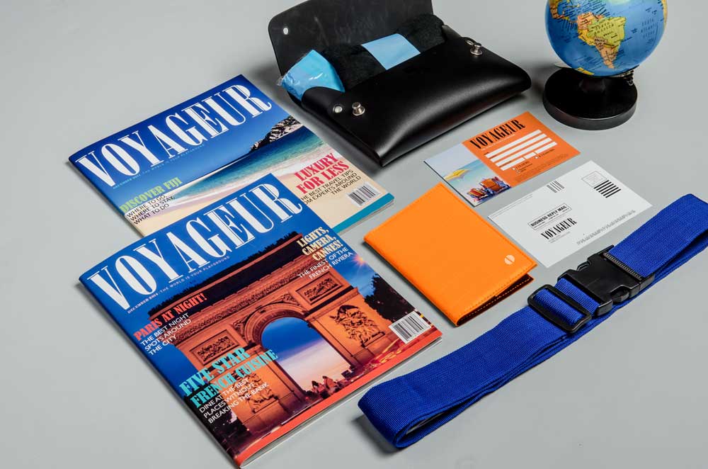
Voyageur is a travel magazine targeted towards budget conscious, well-educated readers ages 25-40. Subscribers are mid-income earners, who want to see the world without breaking the bank.
CONCEPT
The title “Voyageur” means traveler in French, and reflects the brand ideals of sophistication, value, and culture. The content revolves around getting five-star amenities at a three-star price, and highlights exotic destinations around the world.
SOLUTION
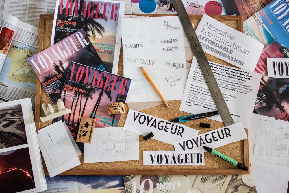
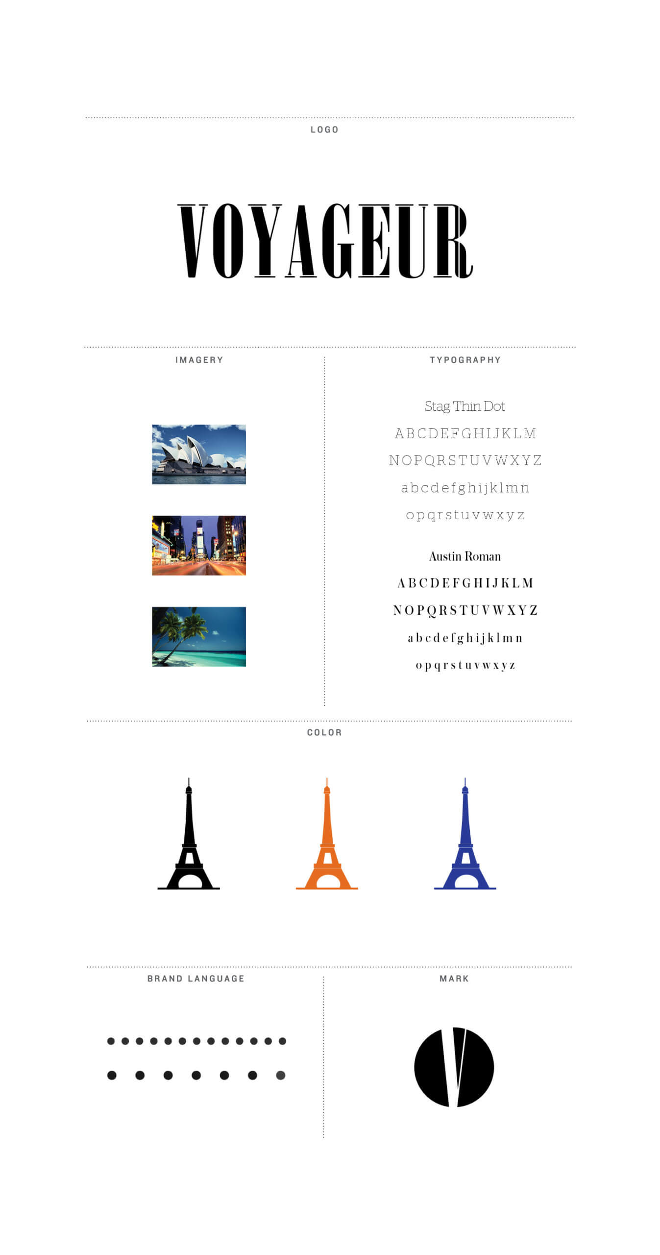
The masthead had to reflect the sophisticated nature of the name and be eye-catching on the shelf. To solve this, I modified the typeface Onyx with thin lines running through the letters to play up the elegance of the letterforms.
The tagline, “The world is your playground”, reflects the brand message that travel is possible and affordable with the right budgeting tools.
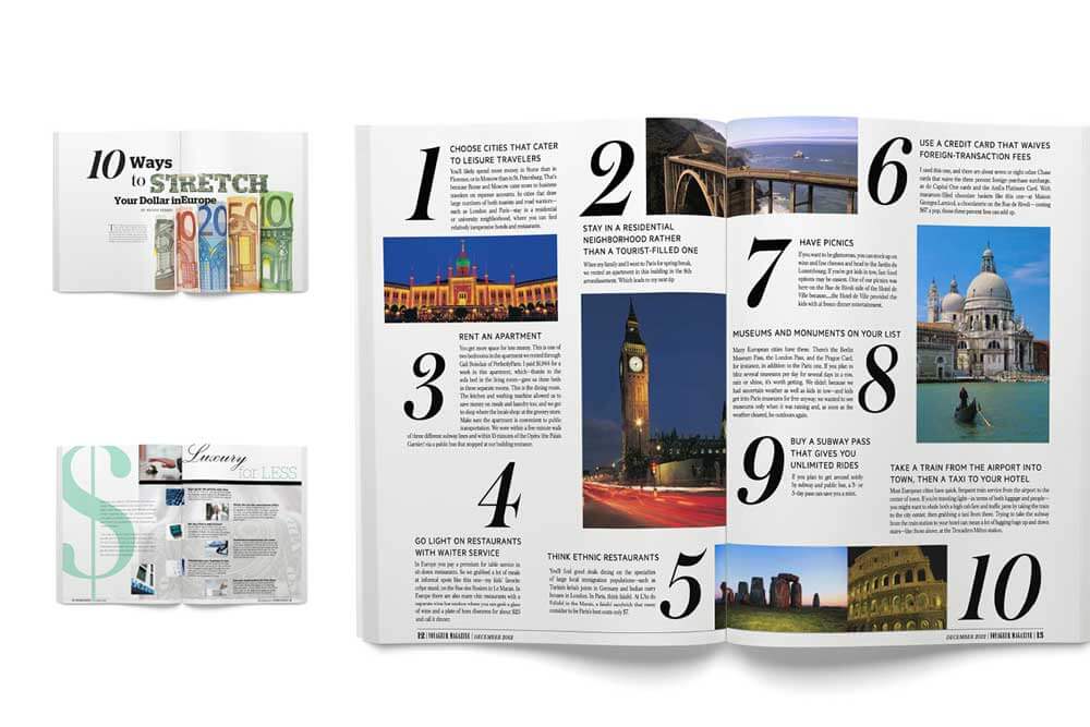
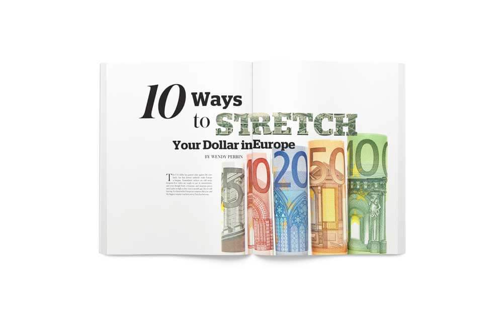
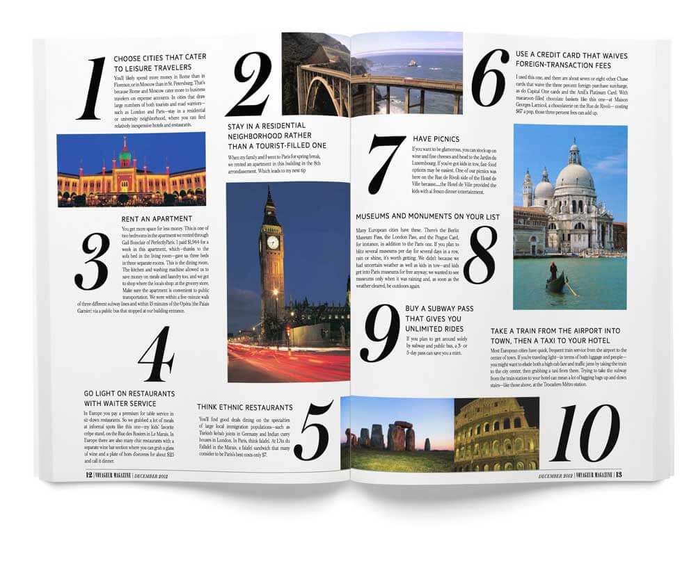
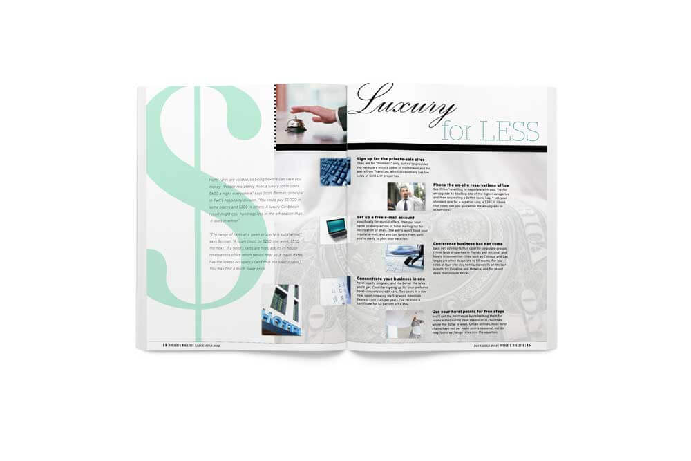
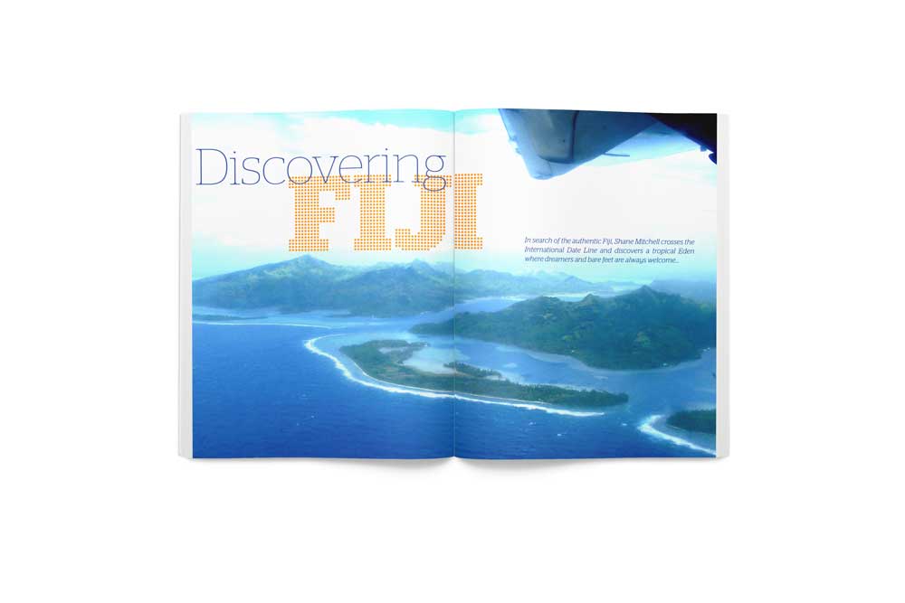
A 14-column grid allows for flexibility and adequate use of white space in this photo-centric magazine. The airy layout is accentuated by the use of dots in the rules and brand language, as well as the dotted typeface Stag. The typeface, Austin, intermixes with Stag throughout the publication to provide contrast and keep the reader engaged in the content.