BACKGROUND
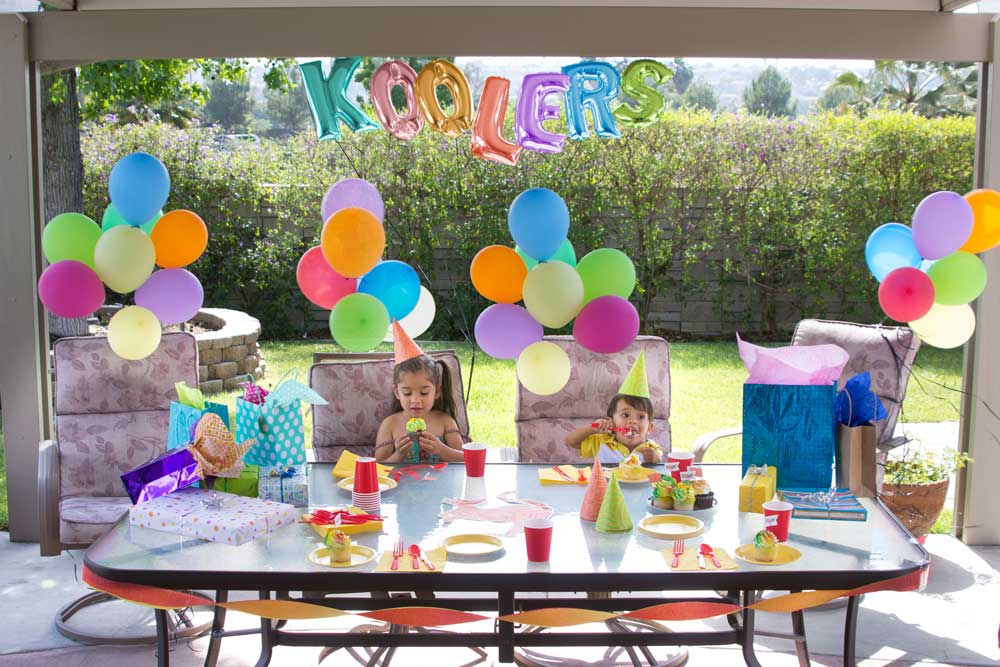
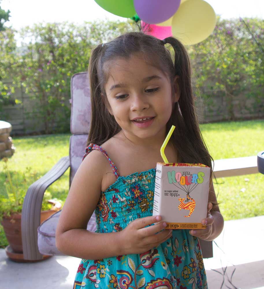
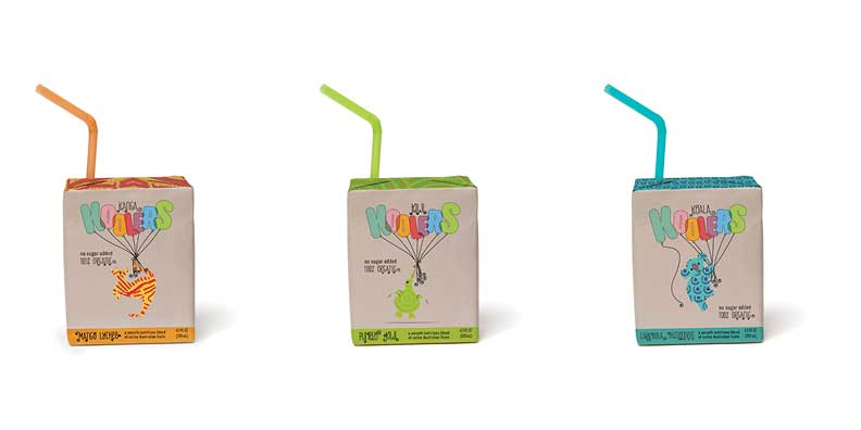
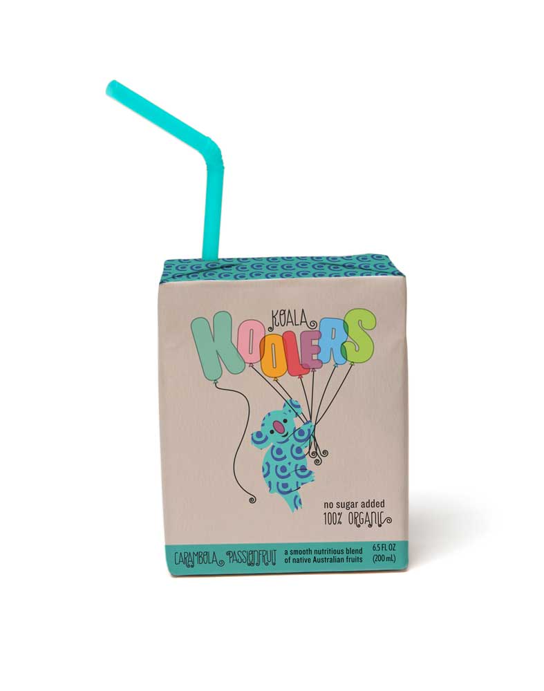
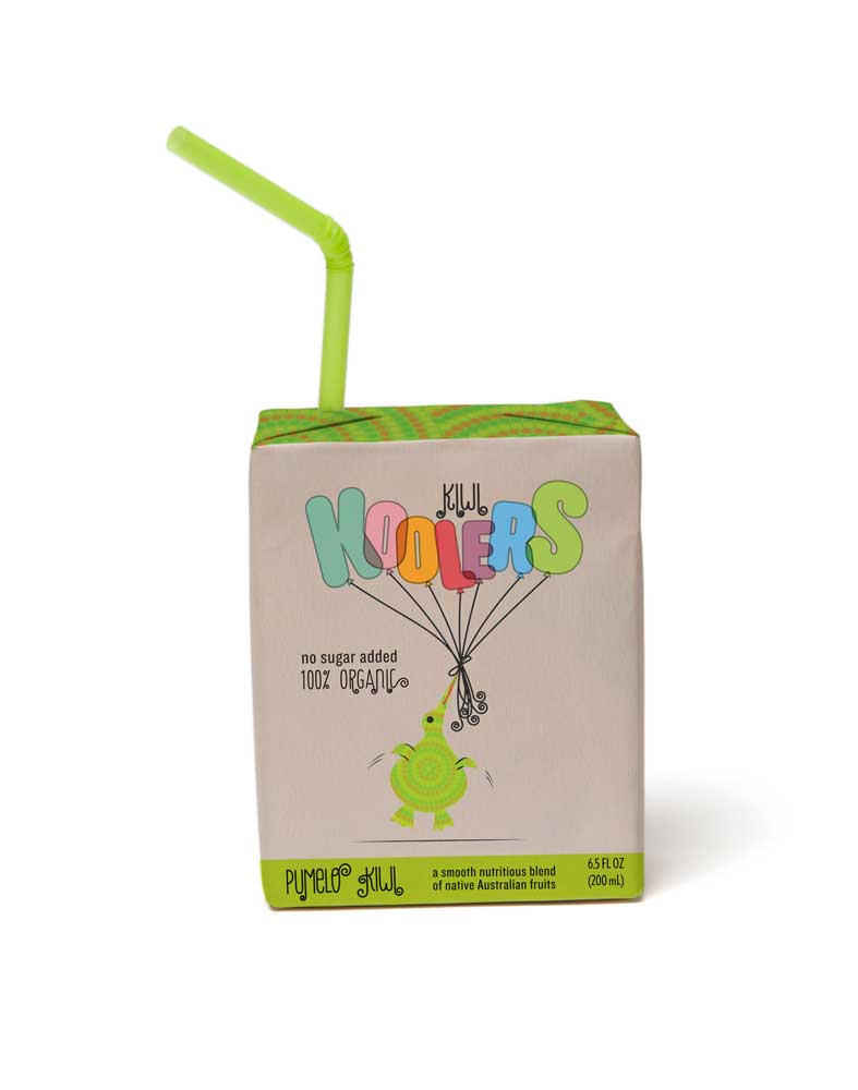
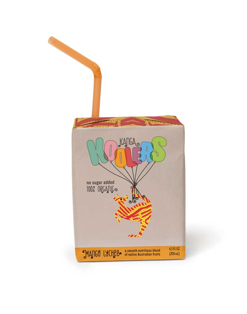
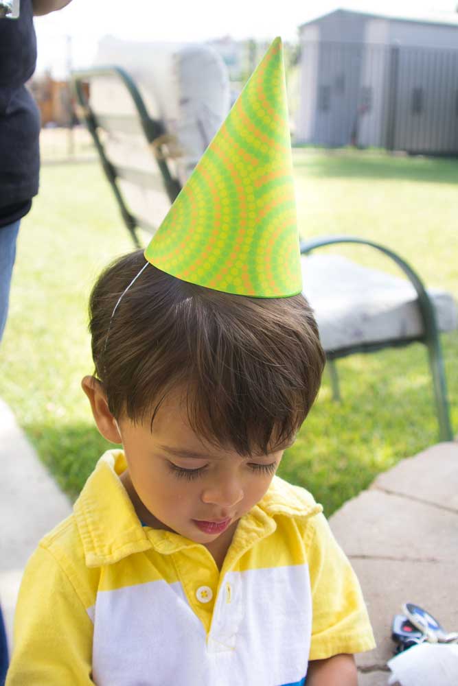
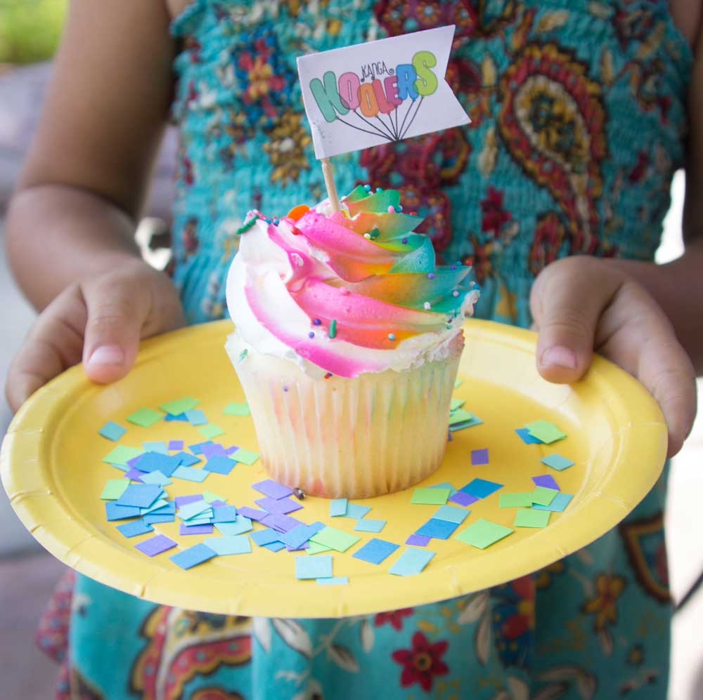
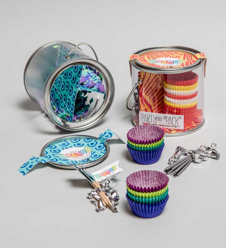
Kanga Koolers is a kid’s organic juice drink and lifestyle brand. It uses a special blend of native Australian and New Zealand fruits to give kids 100% of their daily vitamins. Two sister brands, Kiwi Koolers and Koala Koolers represent the different flavors of the drink. The brand expands further in the kid realm with a line of promotional party items.
CONCEPT
The Koolers brand is centered around nutrients that come from Australia and New Zealand, so the locations had to be incorporated into the branding. The design must to appeal to kids and their moms, as well as reflect the organic nature of the product.
SOLUTION
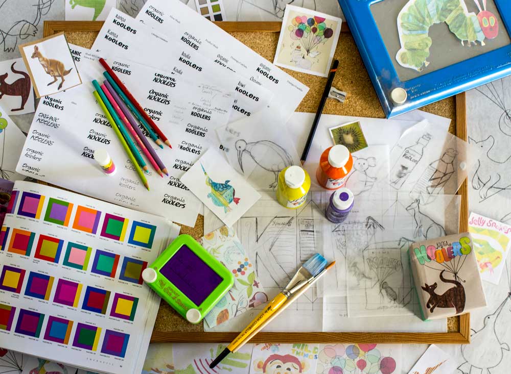
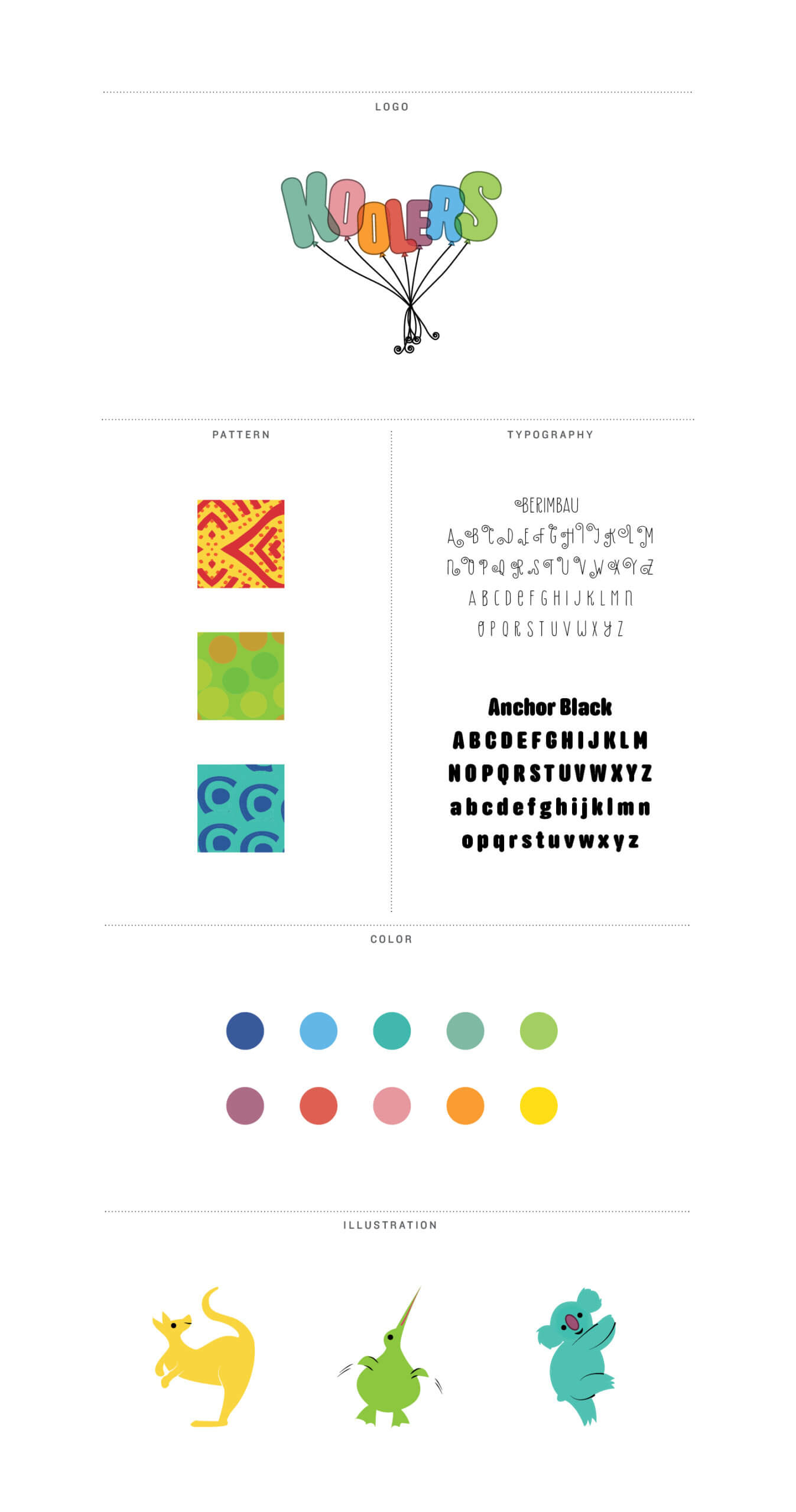
To incorporate Australia and New Zealand into the brand, I researched aboriginal patterns from those areas and adapted the color palette of each pattern to be brighter and more appealing to kids. I also created a color system for each sub-brand: Kanga Koolers uses red and orange, Kiwi Koolers uses green and yellow, and Koala Koolers uses blue and purple.
To further appeal to the younger demographic, I brought in an illustration of a kangaroo, kiwi bird and koala to differentiate each sub-brand.
The logo had to be kid-friendly and fun, so I used the rounded typeface Anchor Black to symbolize colored letter balloons. All of these elements reflect the brand ideals of having fun and being healthy.