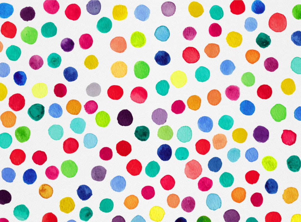
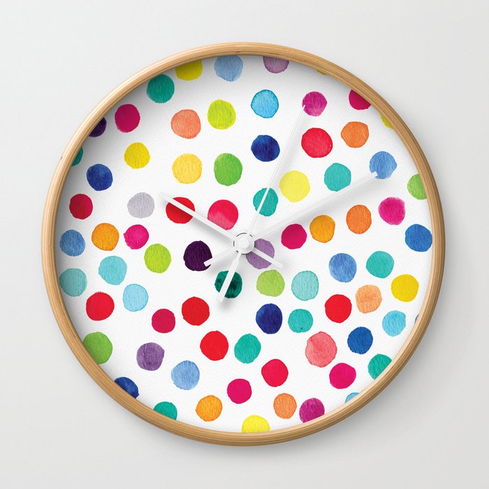
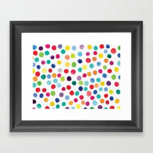
You know I love color – when I was a kid I used every crayon in the crayon box. As an adult, I’m not really that different. This time I wanted to use all the colors in my watercolor palette, and the result was this painting!
It reminds me of confetti, hence the name! I love using bright pops of color, I stuck with that for most of the palette aside from some dark spots in a few places. This was the right strategy – they give just the right amount of contrast while letting your eyes dance around the rest of bright paint spots.
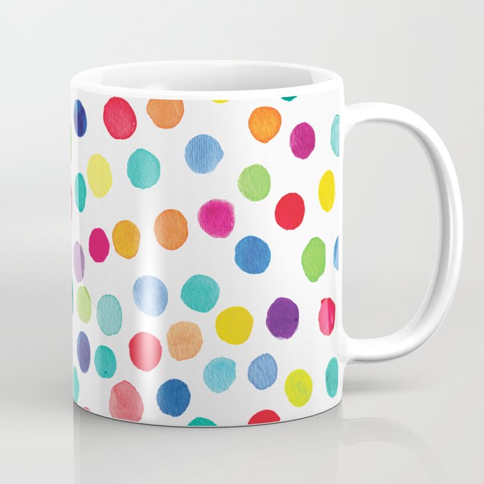
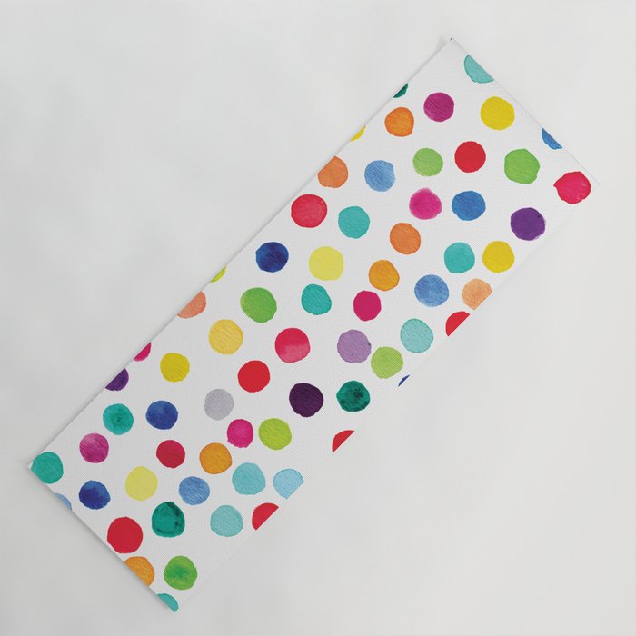
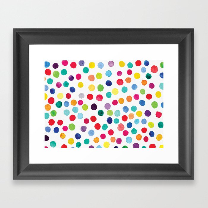
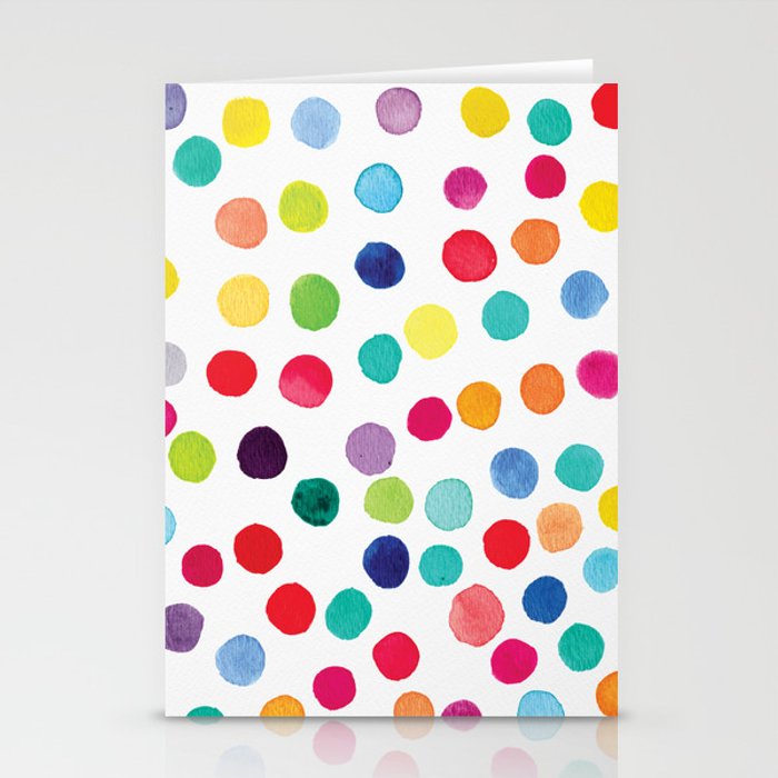
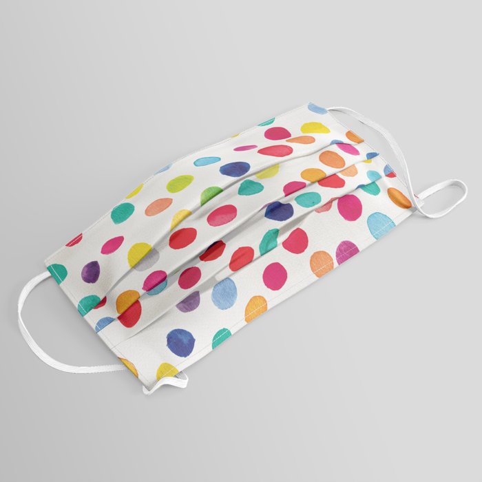
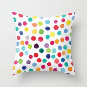
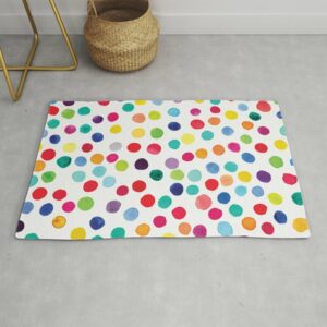
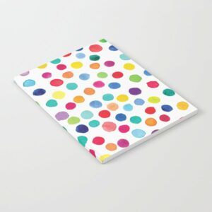
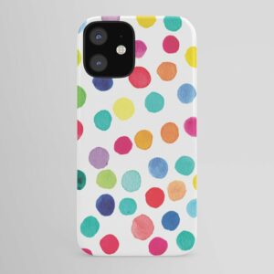
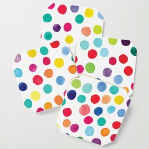
I love the way this turned out, it’s a fun print pattern and works well on a lot of products like yoga mats, stationery, and cell phone cases. You can see some examples below.
If you want to purchase this print feel free to check out the link to my shop. If you’re a company interested in licensing this design, please reach out me on my contact page.
Medium: Watercolor (Wet)
Design: Color Pop Confetti
Color Palette: Bright Red, Pink, Yellow, Blue, Green, Orange and Purple
Mood: Bright, Happy, Fun, Playful, Vivid, Festive
Inspiration: The Crayon Box


0 Comments