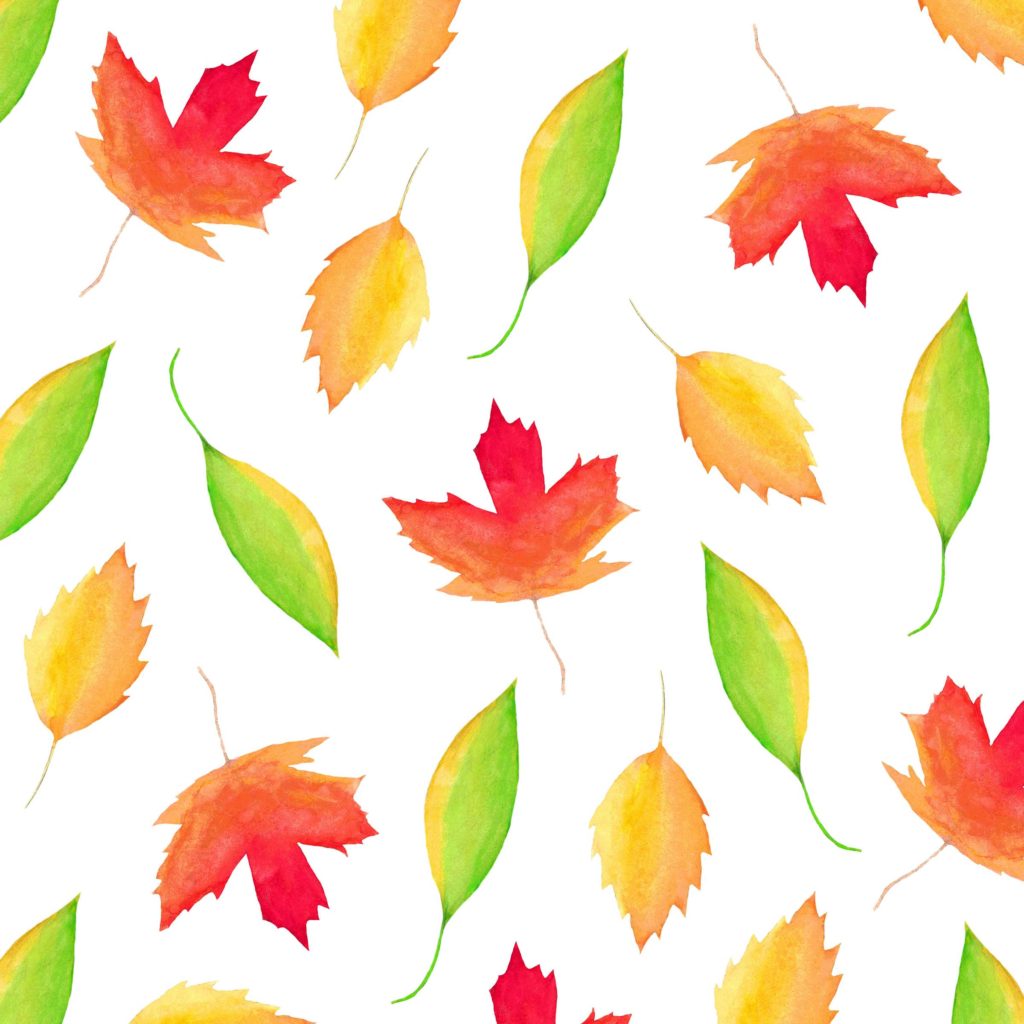
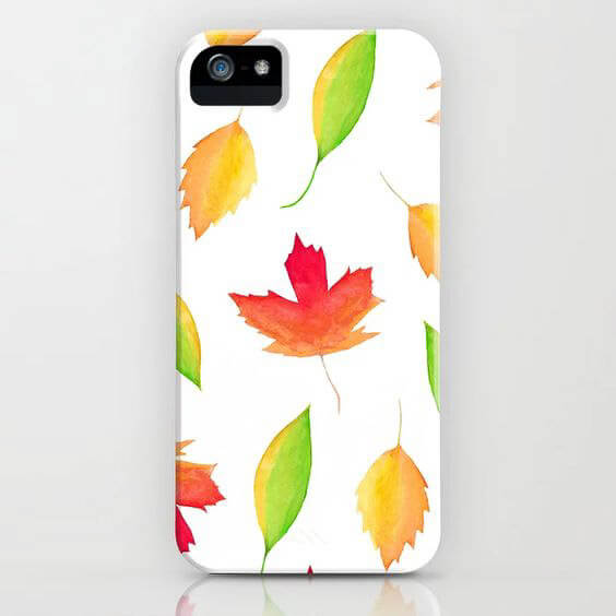
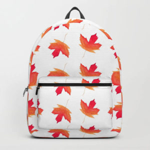
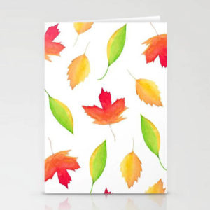
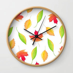
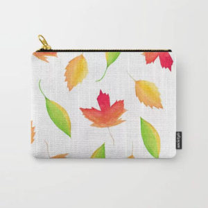
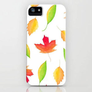
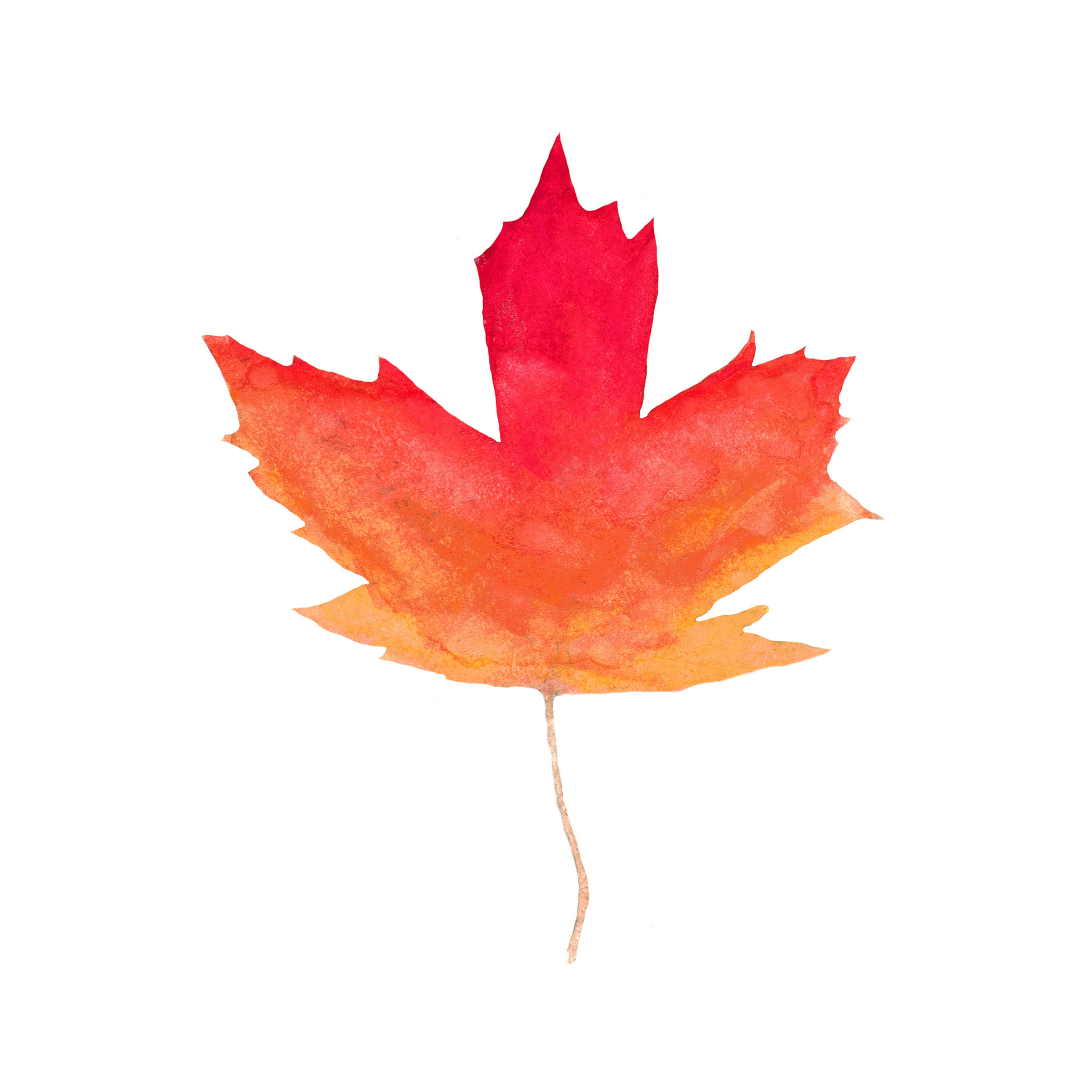
This is another design inspired by my trip to Canada! I decided to play more with the maple leaf design, and add some other colors to celebrate fall.
I love the shape of a maple leaf – and in Canada it’s everywhere! On my trip to Toronto, my cousin and I explored many different parts of the city, which helped inspire this print. I spent a lot of time in Nathan Phillips Square, where they have the Toronto sign. At night they light it up with different colors and play music, and it’s just magical to watch! I’d highly recommend trying to see the sign at night if you get a chance.
And… I love all things fall! The colors, the pumpkin-spiced things, it’s one of my favorite times of year. To represent the season, I played off the color palette of beautiful oranges, yellows and reds that you’d see when the leaves turn in autumn. I also included a leaf that was just turning from green to yellow, to add some range to the pattern.
I decided to make an ombre of the watercolor paint for each individual leaf to give them some depth and interest. Even though it’s a fall palette, I love how bright and cheery this design turned out. It’s a really fun pattern, which is bright enough to use in any season, not just fall.
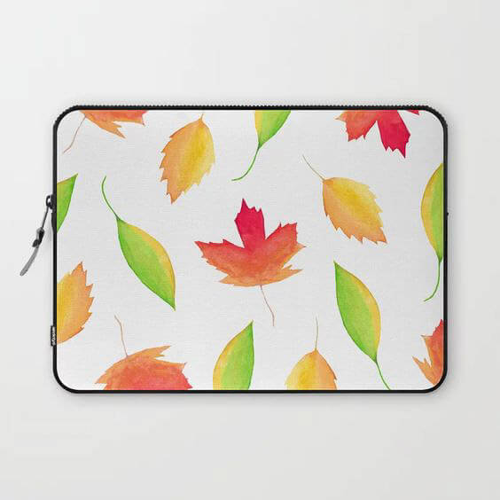
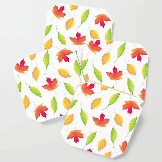
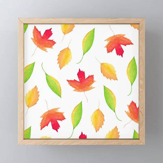
If you want to purchase this print feel free to check out the link to my shop. If you’re a company interested in licensing this design, please reach out me on my contact page. And, if you want to hear more about my trip to Canada, check out the travel blog post!
Medium: Watercolor
Design: Maple Leaves
Color Palette: Fall Vibes – Deep Reds, Oranges, Golden Yellows and Greens
Mood: Fun, Cozy, Bright, Playful
Inspiration: A fun trip to Canada!







0 Comments